In order to develop my system further, I am going to look at similar products that already exist, and how I can implement this research into similar products in order to influence my own product.
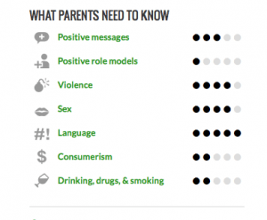
The first product, and the main inspiration behind my 12a? system is Common Sense Media. This is a website that claims to ‘rate, educate, and advocate for kids, families, and schools’. They allow users to log on and post reviews of films, rating them for their severity on 7 main categories. The system is very simple and I like the clean interface, as well as the fonts and small graphics to illustrate the categories.
However, as the website relies on it’s users to upload reviews (as either parents or children) there are a few discrepancies that can occur. For example it allows anyone to pretend to be a parent, and post a review of a very graphic film saying ‘suitable for children’ for example. For my system I will implement this very simple graphic with categories, however I will make sure only a specific team of people can post reviews, and not allow anyone to log on.
The second main inspiration is the parent’s guide on IMDB. It is less simple to follow than Common Sense Media, however it is a trusted review, and posts often in more detail, covering warnings that will spoil the plot with spoiler alerts:
The way they cover up major plot points with spoiler alerts I believe to be very effective, however it is not very visually pleasing, and you have to physically read the review to gain information and warnings, which a parent may not have time to do if they are quickly deciding on a film in the cinema. Therefore I will aim to implement a ‘spoiler alert’ system similar to IMDB’s, and I will aim to have the same level of detail but I will aim to make my product much more user friendly, and a more visual product – providing the info as quickly as possible – like in Common Sense Media. Additionally this parent’s guide section isn’t easy to find on the IMDB webpage.
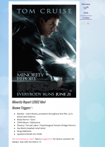
The final inspiration in terms of trigger warnings for my product is the tumblr page ‘This Could be Triggering’ in which they show films, and what potential triggers that are present within the film e.g. Suicide, Death of a Parent etc.
This could be a useful layout in terms of trigger warnings, and I particularly like the sensitive blue and pink colours used. The way they write the triggers isn’t patronising as well which I like.


