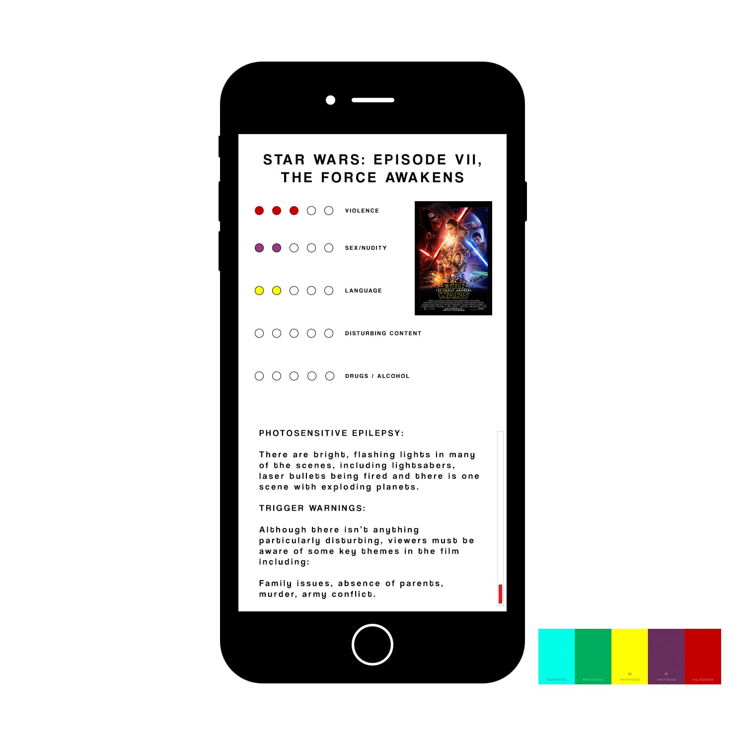
 Here is the design I have created for the health warning section. Originally I had the background rectangle as black and text as white, however it soon became apparent that such a heavy contrast of black and white on one screen could be damaging for people with photosensitive health issues. As there is no such ‘scale’ to identify these warnings, I think we will need to implement a more detailed description based service, rather than the ‘out of 5’ scale that other issues such as violence can be categorised by.
Has a more detailed description-based service implementation plan, rather than an ‘beyond 5’ scale that can be categorized by other issues such as violence implemented?
how to created for the health warning section?