R&D Research: Proposal

I have realised that I have not yet included my proposal on my blog:


Semester B Project Proposal Form

Name / Team member names: Adam Canning

Working title: 12A?

Blog URL: https://adamcanningranddigital.blogs.lincoln.ac.uk/

What is the intended idea / concept behind the proposed project?


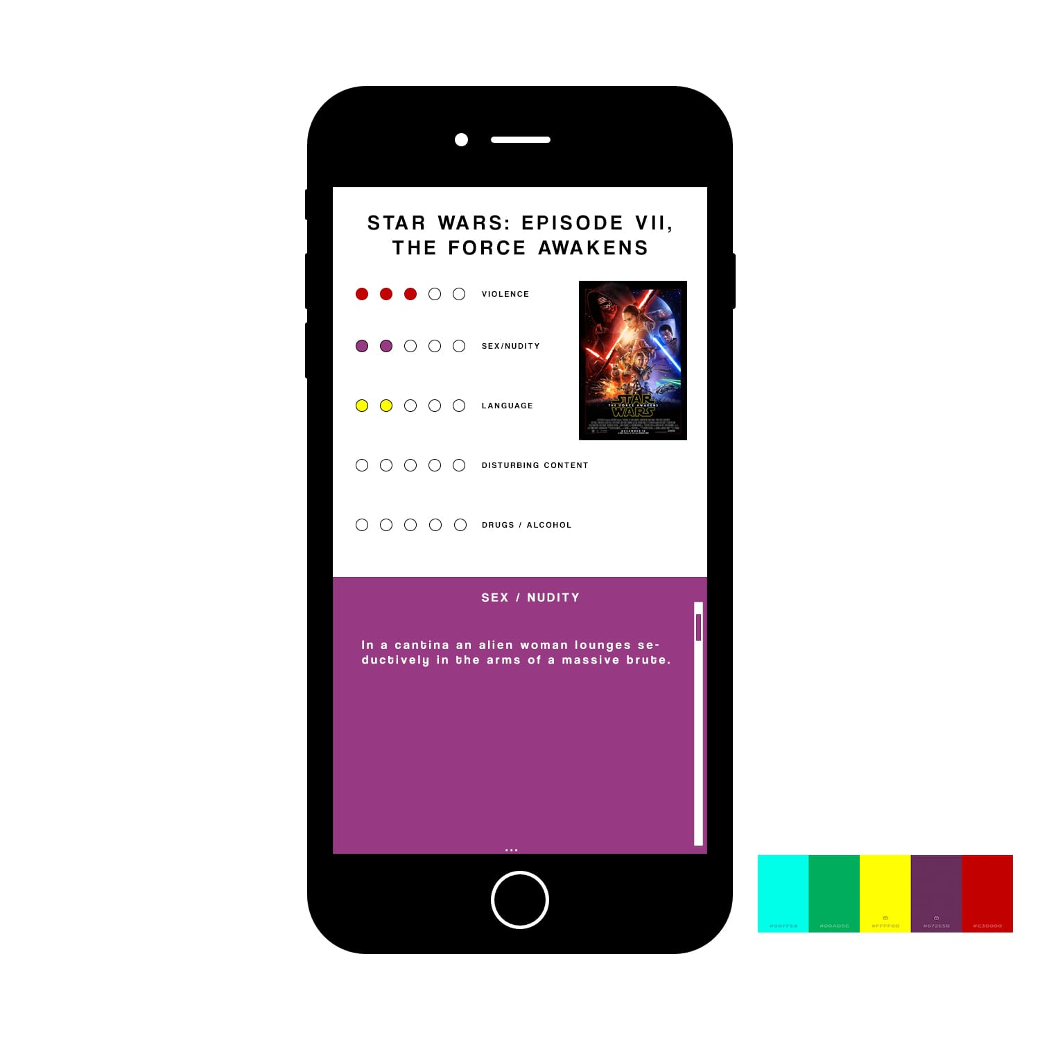
My idea revolves around the current transparency regarding 12a rated films. Currently, the age rating relies on a parent’s decision, which can often be very misinformed as there isn’t a lot of information on the rating regarding potentially harmful imagery, particularly regarding the usual parameters such as violence, nudity etc but also other lesser used parameters such as negative gender representations, negative portrayals of race etc. My system would be a way of informing parents of what certain films contain, so that they can make a more informed decision on whether their children are ready to see certain 12a films.


Additionally there will be health warnings regarding epilepsy, PTSD and other mental and physical disorders that films could potentially trigger (for example flashing lights).


This will take the form of a QR code that could appear on the back of a DVD, a film poster, perhaps even before a film trailer or before the actual film. The scan will then bring up the information about the film for parents.


Justify the idea / concept in terms of the needs for its existence (if purely for entertainment, state this and how the output will be innovative/original and creative):

The concept is needed to provide greater protection for vulnerable children when it comes to violence, nudity and other potentially harmful imagery present within 12a films. It will inform parents about what the film contains in terms of it’s content, in order for them to make an informed decision as to whether their child is ready to watch it or not. The output will be original as it will lead to more awareness regarding both 12a films and it’s content, and it is innovative as it can be exported globally.

It will be original as the majority of film information does not take into consider things such as negative gender roles, race representations, and health issues such as PTSD and Epilepsy.


Describe the intended audience:

This will mainly be aimed at parents taking their children to the cinema for films rated 12a.


How will this project extend your or your team’s creative and technical skills?


It will extend my technical skills as I will have to create a universally understandable system that can be exported globally. My technical skills will be improved by my utilisation of QR, and my design skills shall be improved by my creation of a simple and functional user interface once the QR code is scanned.


Outline how the practical work will be carried out by you / the team (division of labour) and the time-scales involved for each task:


The practical work will be carried out by me. Initially I will research how the current age rating system works in cinema – and how I can fit my system to somewhat link in with this, so that the system isn’t too confusing for people to use. I will then begin researching similar systems that exist, for example on parenting websites, and how I can use these to develop the system. I will also research into conditions that films usually do not take into account like PTSD, Epilepsy etc and what things in films can trigger these conditions. In addition to this I shall research my target demographic of parents, discovering the main issues they are worried about when it comes to the films their children watch – and thus I can tailor the system to address these concerns.


I will then begin designing the system, initially producing an Alpha test demo, then moving on to the Beta and finally producing the QR and interface design example on a film of choice to showcase the system and how it works.


What other work (by animators, designers, film-makers, writers, digital media producers, etc.) is relevant to your project? (This work may either be relevant for its conceptual or technical similarity):

The work by BBFC shall be relevant as they are the current providers of the film rating system in the UK. The work of various parenting websites will be relevant as these are often the trusted go-to websites (mumsnet for example). I will also look at common sense media, one of my main competitors; a user generated review system that takes things like positive role models etc into consideration.


List any critical texts that are relevant to your conceptual intentions:

I will need to look at critical texts that are surrounding media effects, for example texts about how violence can affect children, and thus how we need to protect them from such harmful material early in their development. I will also need to look at texts that cover triggering material (mainly regarding PTSD and Epilepsy). This will make me more informed when it comes to warning people, as previously I may miss things that could potentially be dangerous.


Any other information not covered above:


R&D Research 21: Development

Thus far I have been on track, but I still need to push on to get my project finished. In order for me to finish it I will need to build on my finished designs for the website as well as the app, and make sure they are as polished and functional as can be. I will need to make the alpha tests, gain some feedback from users, then proceed to make the beta test, gain some feedback from that and then eventually create the final product – in my case a proof of concept.


R&D Research 20: Further Development of Mockups

As I have stated previously, the original mockups for the app need a bit more ‘polishing’. Therefore I have built upon these and made a visual ‘prototype’ of sort, to show how the final product will look on the app.

QR Redirect mockup2To improve both the aesthetics and functionality of the interface, I have added the category onto the box, to make it easier to follow for the audience. In addition, I have added a visual scroll bar to show the audience what to do, and how to scroll through the information. The addition of an ellipsis at the bottom connotes that there is more information to be seen, and so I will implement this when information needs to be scrolled to.

QR Redirect mockup3This is an example of how the text would look under the ‘Sex/Nudity’ category. I enjoy the way the white text can stand out on each background. I have also changed the colour of the scroll bar for this section. As the user scrolls through this it will slowly bring up the yellow box, containing information about language etc. Originally I had planned to have the information section taking up the whole screen – although upon designing, I have decided I’m going to keep the top half displaying the infographic, poster and title of the film – and just have the bottom half scroll, this is so audience members can remember the film that they are looking at, rather than having to scroll all the way back up. This I believe would also separate it from a generic mobile web page.

R&D Research 19: App/Web Mockups

Firstly, here is the mockup of the app before the QR code has been scanned:

QR Scan App

In the actual app, the white will be replaced with the camera, allowing the user to scan the qr code between the bars. After this, the user will be redirected to an interface similar to the next mockup:

QR Redirect mockupThis is only a mockup, and so the text is generated but I would like the design of the final output to be not too dissimilar to this. The red square at the bottom will move up as the user scrolls and turn into the purple square, which will contain text and information regarding sex/nudity.

I am pleased with how these mockups have turned out, particularly with the fonts, colours and 2d ‘flat’ design which make it look quite professional. To make it the final product however, I will have to polish it a little, maybe adding the logo in somewhere to reinforce the brand. I could also perhaps add a screenshot of the film poster in the white space above the red block of text next to the chart – so that the users are aware of what film they are looking into.

R&D Research 18: Description of Treatment

In order for my project to be effective, I will need to plan out how the website will look, along with function – as well as the app and the QR code that will redirect to it.

After designing my logo, I am now aware of the aesthetic theme I want for the project. I am going to focus on the the 5 colours of the circles; blue; green; yellow; purple and red, to reinforce the 5 different categories, and simultaneously making the interface appealing. This rainbow theme will also connote the theme of youth, showing that this is a product to help and protect children. In addition to this, the rainbow will help to highlight the five categories that we will measure films against. These are:

– Violence

– Sex/Nudity

– Bad Language

– Disturbing Imagery

– Drugs/Alcohol

Each category will be assigned a colour, to make the system more accessible to the audience. Once redirected from the QR code, the app will have sections that are this colour, with the text over the top. For example if the user scanned the QR code with their smartphone, they would then be redirected to the film’s page. At the top of the page will be the title of the movie, a quick visual summary of the film’s content in terms of the 5 categories (for example 3 circles out of 5 under violence) and as the user scrolls down the different colour co-ordinated sections of text will have a more detailed description of why the film has been given 3 circles out of 5. The QR codes placed on other film posters will not impose too much, it will simply be the QR code with the ’12a?’ logo next to it, and the same for the codes on movie trailers.

Here is the colour palette that I shall be using when designing the website and app.

Screen Shot 2016-03-09 at 20.36.52

This is only a 5 colour palette, and doesn’t incorporate white and black, that I will also be using in the website. Although I feel these colours clash when close together, if they are displayed as portrait squares that change as the user navigates downward it will be more effective, it is just off-putting because they are together, but in the final output they will not be.