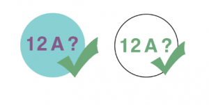
I have now begun designing logos for my service. I wanted it to be a logo that would stand out on a poster, video, website and primarily an app icon. I took inspiration from the existing 12a certification logo, a red circle with a white ’12a’ in the middle. I wanted it to be as minimal as possible, so it would be recognisable on any format, whether it be large format or scaled down.
These were my initial mockups. I also took inspiration from the common sense media colours, as well as the use of a tick. The green makes the service seem trusted and will reassure my target audience of parents. The use of the pink and blue took inspiration from the design of the trigger warning blog, the blue and pink I believe compliment each other well, and connote a youthful theme to the product.
