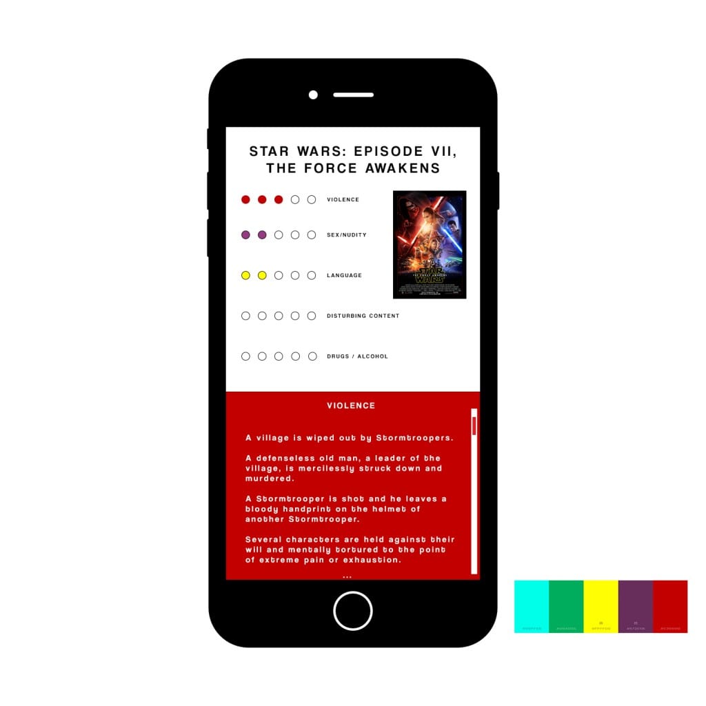
As I have stated previously, the original mockups for the app need a bit more ‘polishing’. Therefore I have built upon these and made a visual ‘prototype’ of sort, to show how the final product will look on the app.
 To improve both the aesthetics and functionality of the interface, I have added the category onto the box, to make it easier to follow for the audience. In addition, I have added a visual scroll bar to show the audience what to do, and how to scroll through the information. The addition of an ellipsis at the bottom connotes that there is more information to be seen, and so I will implement this when information needs to be scrolled to.
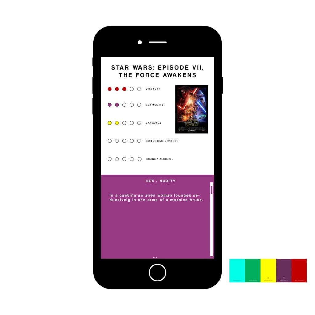
 This is an example of how the text would look under the ‘Sex/Nudity’ category. I enjoy the way the white text can stand out on each background. I have also changed the colour of the scroll bar for this section. As the user scrolls through this it will slowly bring up the yellow box, containing information about language etc. Originally I had planned to have the information section taking up the whole screen – although upon designing, I have decided I’m going to keep the top half displaying the infographic, poster and title of the film – and just have the bottom half scroll, this is so audience members can remember the film that they are looking at, rather than having to scroll all the way back up. This I believe would also separate it from a generic mobile web page.
Comments are closed.