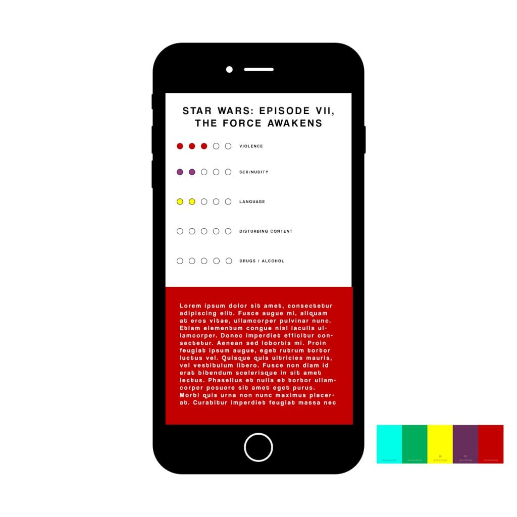
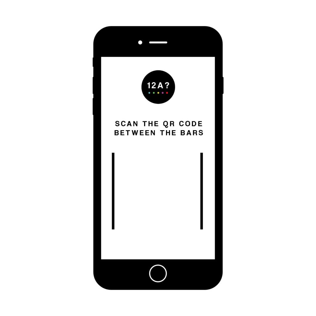
Firstly, here is the mockup of the app before the QR code has been scanned:
In the actual app, the white will be replaced with the camera, allowing the user to scan the qr code between the bars. After this, the user will be redirected to an interface similar to the next mockup:
 This is only a mockup, and so the text is generated but I would like the design of the final output to be not too dissimilar to this. The red square at the bottom will move up as the user scrolls and turn into the purple square, which will contain text and information regarding sex/nudity.
I am pleased with how these mockups have turned out, particularly with the fonts, colours and 2d ‘flat’ design which make it look quite professional. To make it the final product however, I will have to polish it a little, maybe adding the logo in somewhere to reinforce the brand. I could also perhaps add a screenshot of the film poster in the white space above the red block of text next to the chart – so that the users are aware of what film they are looking into.

Comments are closed.