In order for my project to be effective, I will need to plan out how the website will look, along with function – as well as the app and the QR code that will redirect to it.
After designing my logo, I am now aware of the aesthetic theme I want for the project. I am going to focus on the the 5 colours of the circles; blue; green; yellow; purple and red, to reinforce the 5 different categories, and simultaneously making the interface appealing. This rainbow theme will also connote the theme of youth, showing that this is a product to help and protect children. In addition to this, the rainbow will help to highlight the five categories that we will measure films against. These are:
– Violence
– Sex/Nudity
– Bad Language
– Disturbing Imagery
– Drugs/Alcohol
Each category will be assigned a colour, to make the system more accessible to the audience. Once redirected from the QR code, the app will have sections that are this colour, with the text over the top. For example if the user scanned the QR code with their smartphone, they would then be redirected to the film’s page. At the top of the page will be the title of the movie, a quick visual summary of the film’s content in terms of the 5 categories (for example 3 circles out of 5 under violence) and as the user scrolls down the different colour co-ordinated sections of text will have a more detailed description of why the film has been given 3 circles out of 5. The QR codes placed on other film posters will not impose too much, it will simply be the QR code with the ’12a?’ logo next to it, and the same for the codes on movie trailers.
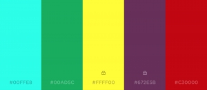
Here is the colour palette that I shall be using when designing the website and app.
This is only a 5 colour palette, and doesn’t incorporate white and black, that I will also be using in the website. Although I feel these colours clash when close together, if they are displayed as portrait squares that change as the user navigates downward it will be more effective, it is just off-putting because they are together, but in the final output they will not be.
